Global Life Quality Dashboard
Overview
- Interactive Streamlit dashboard analyzing relationships between life expectancy, GDP, and poverty rates worldwide using data from Our World in Data.
- Features predictive modeling and comprehensive country-specific analysis.

Technical Stack
Python
Streamlit
Plotly
Scikit-learn
Pandas
- • Streamlit for interactive web interface
- • Plotly for dynamic visualizations
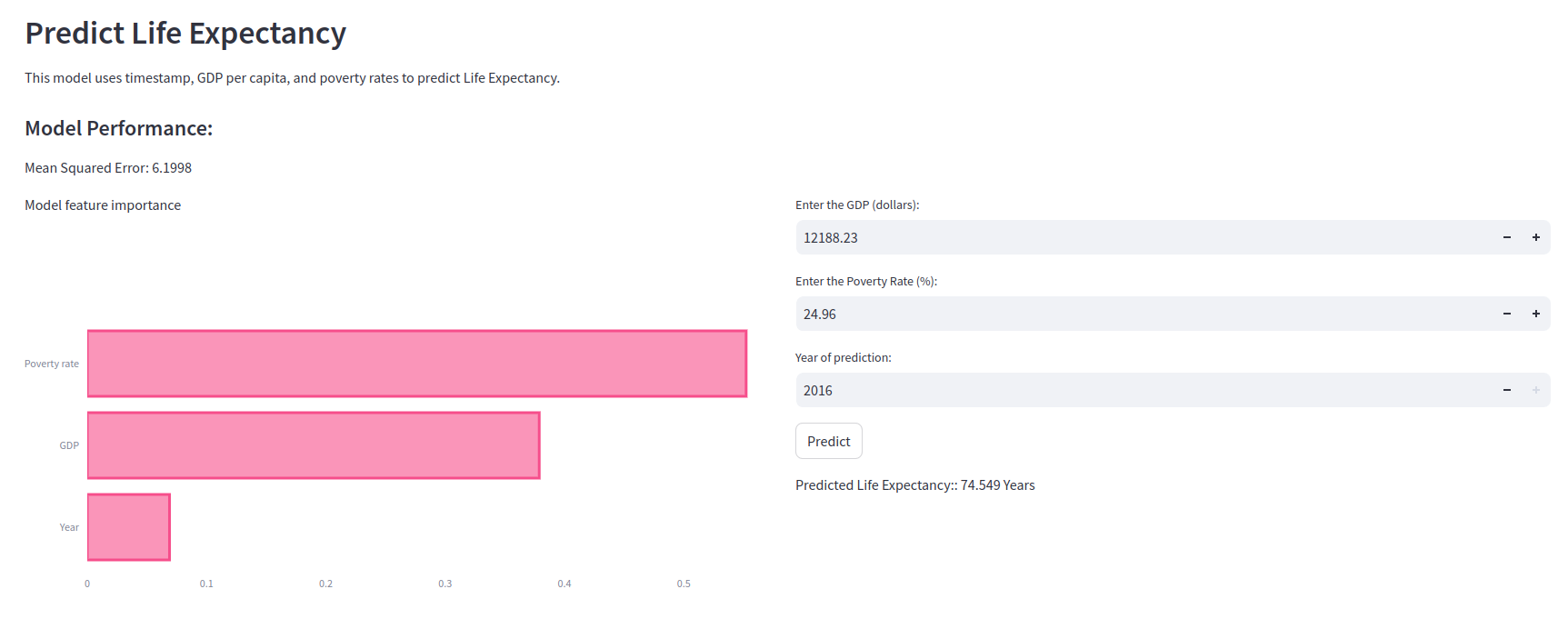
- • Random Forest model for life expectancy prediction
- • Pandas for data processing and analysis
Implementation
The dashboard features three main components:
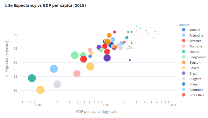
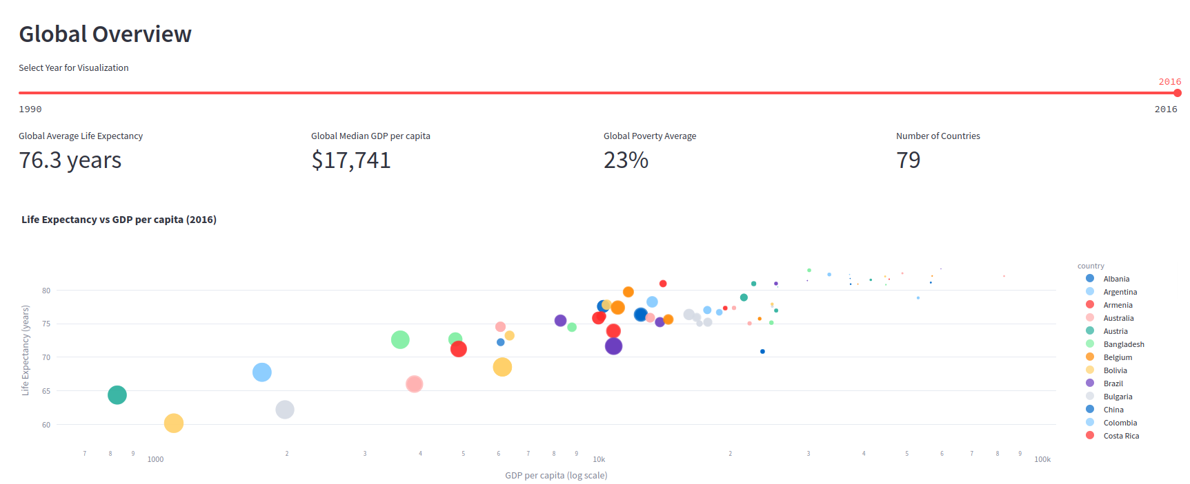
- • Global Overview: Interactive scatter plots showing relationships between economic indicators and life expectancy
- • Country Deep Dive: Detailed time series analysis for individual countries
- • Predictive Analytics: Machine learning model predicting life expectancy based on economic factors


Results
The dashboard reveals strong correlations between economic indicators and life quality metrics. Key findings include:
- • Strong positive correlation between GDP and life expectancy
- • Even stronger inverse relationship between poverty rates and life expectancy